


Features:
- Set the scroll speed of the images
- Set background repeat style
- Set background image size, 100%, cover, contain, etc
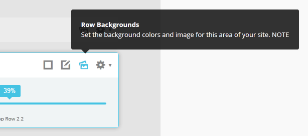
- Set custom backgrounds for all s5 rows in the framework.
- Enable or disable parallax on a per row basis
Admin Area Of The Backgrounds Tab:
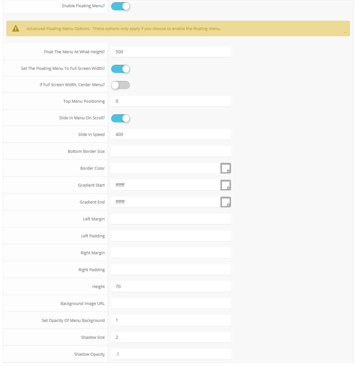
Features at a glance:
- Set a backgroud image to the menu, gradient or solid color
- Set to snap or smooth scroll in
- Determine at which point as you scroll down your page that the menu drops in
- and many more features, just check out the screenshot below
Admin area of the Floating Menu:
This is a sample blockquote. Use <blockquote><p>Your content goes here!</p></blockquote> to create a blockquote.
This is an image with the "boxed" class applied:

This is an image with the "boxed_black" class applied:
This is an image with the "padded" class applied:
This is an image with the "full_width" class applied. This can also be done automatically in the template configuration. Be sure to review our Vertex Guide here for other full width image options.

Heading 1
Heading 2
Heading 3
Heading 4
Heading 5
<a> With readon_highlight1 class applied:
readon_highlight1
<a> With readon_highlight2 class applied:
readon_highlight2
<a> With highlight1_button class applied:
highlight1_button
<a> With highlight2_button class applied:
highlight2_button
<span> With highlight1_text class applied:
highlight1_text
<span> With highlight2_text class applied:
highlight2_text
<span> With uppercase_letters class applied:
uppercase_letters
#s5_code { width: 30px; color: #fff; line-height: 45px; }
- This is an Ordered List
- Congue Quisque augue elit dolor nibh.
- Condimentum elte quis.
- Opsum dolor sit amet consectetuer.
- This is an Unordered List
- Congue Quisque augue elit dolor nibh.
- Condimentum elte quis.
- Opsum dolor sit amet consectetuer.
- This is an Unordered List with class plus
- Congue Quisque augue elit dolor nibh.
- Condimentum elte quis.
- Opsum dolor sit amet consectetuer.
- This is an Unordered List with class ul_arrow
- Congue Quisque augue elit dolor nibh.
- Condimentum elte quis.
- Opsum dolor sit amet consectetuer.
- This is an Unordered List with class ul_star
- Congue Quisque augue elit dolor nibh.
- Condimentum elte quis.
- Opsum dolor sit amet consectetuer.
- This is an Unordered List with class ul_bullet
- Congue Quisque augue elit dolor nibh.
- Condimentum elte quis.
- Opsum dolor sit amet consectetuer.
The following list will support lists up to number 9, add the following class to the UL wrapping the below LI elements, class="ul_numbers":
- This is a sample styled number list <li class="li_number1">Your content goes here!</li>
- This is a sample styled number list <li class="li_number2">Your content goes here!</li>
- This is a sample styled number list <li class="li_number3">Your content goes here!</li>
- This is a sample styled number list <li class="li_number4">Your content goes here!</li>
<div class="s5_pricetable_3">
<div class="s5_pricetable_column">
<div class="s5_pricetable_column_padding">
<div class="s5_title">Basic</div>
<span class="dollarsign">$</span><span class="price">49</span><span class="month">/per month</span>
<div class="s5_options">
Unlimited Space & Traffic<br>
99.9% Server Uptime<br>
24/7 Customer Care<br>
30 Days Money Back<br><br>
</div>
<div class="s5_horizontalrule"></div>
<div class="s5_buttoncenter"><a class="button s5_pricetable" href="#">Choose</a></div>
</div>
</div>
<div class="s5_pricetable_column recommended">
<div class="s5_pricetable_column_padding">
<div class="s5_title">Standard</div>
<span class="dollarsign">$</span><span class="price">79</span><span class="month">/per month</span>
<div class="s5_options">
Unlimited Space & Traffic<br>
99.9% Server Uptime<br>
24/7 Customer Care<br>
30 Days Money Back<br>
FREE Domain Name<br>
Personal Concierge
</div>
<div class="s5_horizontalrule"></div>
<div class="s5_buttoncenter"><a class="button s5_pricetable" href="#">Choose</a></div>
</div>
</div>
<div class="s5_pricetable_column">
<div class="s5_pricetable_column_padding">
<div class="s5_title">Premium</div>
<span class="dollarsign">$</span><span class="price">99</span><span class="month">/per month</span>
<div class="s5_options">
Unlimited Space & Traffic <br>
99.9% Server Uptime<br>
24/7 Customer Care<br>
30 Days Money Back<br>
FREE Domain Name
</div>
<div class="s5_horizontalrule"></div>
<div class="s5_buttoncenter"><a class="button s5_pricetable" href="#">Choose</a></div>
</div>
</div>
<div style="clear:both;"></div>
</div>
Make any Youtube, Vimeo, etc video you embed to your site work with responsive by wrapping with a DIV with a class of "s5_video_container". The below Youtube Video will shrink when the area its contained in gets too small for it:
Use the icons below in conjunction with the class icon_circle:
<i class="icon-cogs icon_circle" style="float:left"></i>
icon-adjust
icon-anchor
icon-archive
icon-asterisk
icon-barcode
icon-beer
icon-bell
icon-bolt
icon-book
icon-bookmark
icon-briefcase
icon-bug
icon-bullhorn
icon-bullseye
icon-calendar
icon-bullhorn
icon-bullseye
icon-calendar
icon-camera
icon-camera-retro
icon-certificate
icon-check
icon-circle
icon-cloud
icon-cloud-download
icon-cloud-upload
icon-code
icon-code-fork
icon-coffee
icon-cog
icon-cogs
icon-comment
icon-comments
icon-compass
icon-credit-card
icon-crop
icon-dashboard
icon-desktop
icon-download
icon-edit
icon-envelope
icon-eraser
icon-exchange
icon-exclamation
icon-external-link
icon-female
icon-fighter-jet
icon-film
icon-filter
icon-fire
icon-fire-extinguisher
icon-flag
icon-flag-checkered
icon-folder-open
icon-gamepad
icon-gear
icon-gears
icon-gift
icon-glass
icon-globe
icon-group
icon-headphones
icon-heart
icon-home
icon-inbox
icon-info
icon-key
icon-laptop
icon-leaf
icon-legal
icon-level-down
icon-level-up
icon-location-arrow
icon-lock
icon-magic
icon-magnet
icon-mail-forward
icon-mail-reply
icon-mail-reply-all
icon-male
icon-map-marker
icon-microphone
icon-minus
icon-mobile-phone
icon-money
icon-music
icon-pencil
icon-phone
icon-plane
icon-power-off
icon-print
icon-puzzle-piece
icon-qrcode
icon-question
icon-quote-left
icon-quote-right
icon-random
icon-refresh
icon-reply
icon-reply-all
icon-retweet
icon-road
icon-rocket
icon-search
icon-share
icon-shield
icon-shopping-cart
icon-signal
icon-sitemap
icon-sort
icon-sort-up
icon-spinner
icon-star
icon-star-half
icon-star-half-empty
icon-star-half-full
icon-subscript
icon-suitcase
icon-superscript
icon-tablet
icon-tag
icon-tags
icon-tasks
icon-terminal
icon-thumbs-down
icon-thumbs-up
icon-ticket
icon-trophy
icon-truck
icon-umbrella
icon-unlock
icon-unlock-alt
icon-upload
icon-user
icon-volume-down
icon-volume-off
icon-volume-up
icon-wrench
Demo 1:

Demo 2:
Demo 2 Image Tool Tip
Demo 3:
Demo 3 Image Tool Tip
This template comes loaded with options that you can use to customize your site exactly how you want it. Here's how to get to these custom settings:
- In the backend of Joomla go menu item Extensions/Template Manager.
- Click on the title of the template.
- This will bring you to the template manager screen where you can edit the template's parameters.
- Click save when you are done
Every template built on Vertex also comes with its own unique template specific options applicable to that particular template such as highlight colors, social icons, and much more. These features are in addition to the standard functions of Vertex, and are still controlled through the very user friendly interface of Vertex. This page will document the features specific to this template.
Template Specific Configuration Interface of Vertex
Below is a screenshot that shows all the template specific features available in the user friendly Vertex admin:
Custom Highlight Colors
Set your own custom color scheme with the built in highlight colors. There are two built in highlight colors that control menu items, titles, buttons, hover over effects, and much more. You can set these colors to any color that you want.
Top Row1 Inset Shadow
The top_row1 area of this template was designed to have a background image, which is controlled under the Backgrounds tab of Vertex. In addition to that background you set an inset shadow to cover the background image. You can set the size and opacity of this shadow to any size you wish.Social Icons
Easily link to a social media site with the built in social icons found in the header of this template. Simply enter the url of your social site in the configuration and the icon will automatically appear. To disable an icon simply leave the url blank for that particular icon.
Uppercase Leters
Choose to enable or disable uppercase letters on most menu items, buttons, titles and more.

Small Menu
The S5 Flex Menu gives you the ability to have subtext on each menu item. If you choose not to use subtext on the first level links simply choose to disable this option and the menu will automatically down size.

Custom Header Background
At the bottom of the Template Specific tab you will see a separate section dedicated to custom header background options. These options allow you to specify the color or background image of the header. In the image below the header is shown with a repeating static background image. The default background is white, but you can override this with your own background settings as needed. Be sure to read the titles and tooltips of each feature to see what each does.